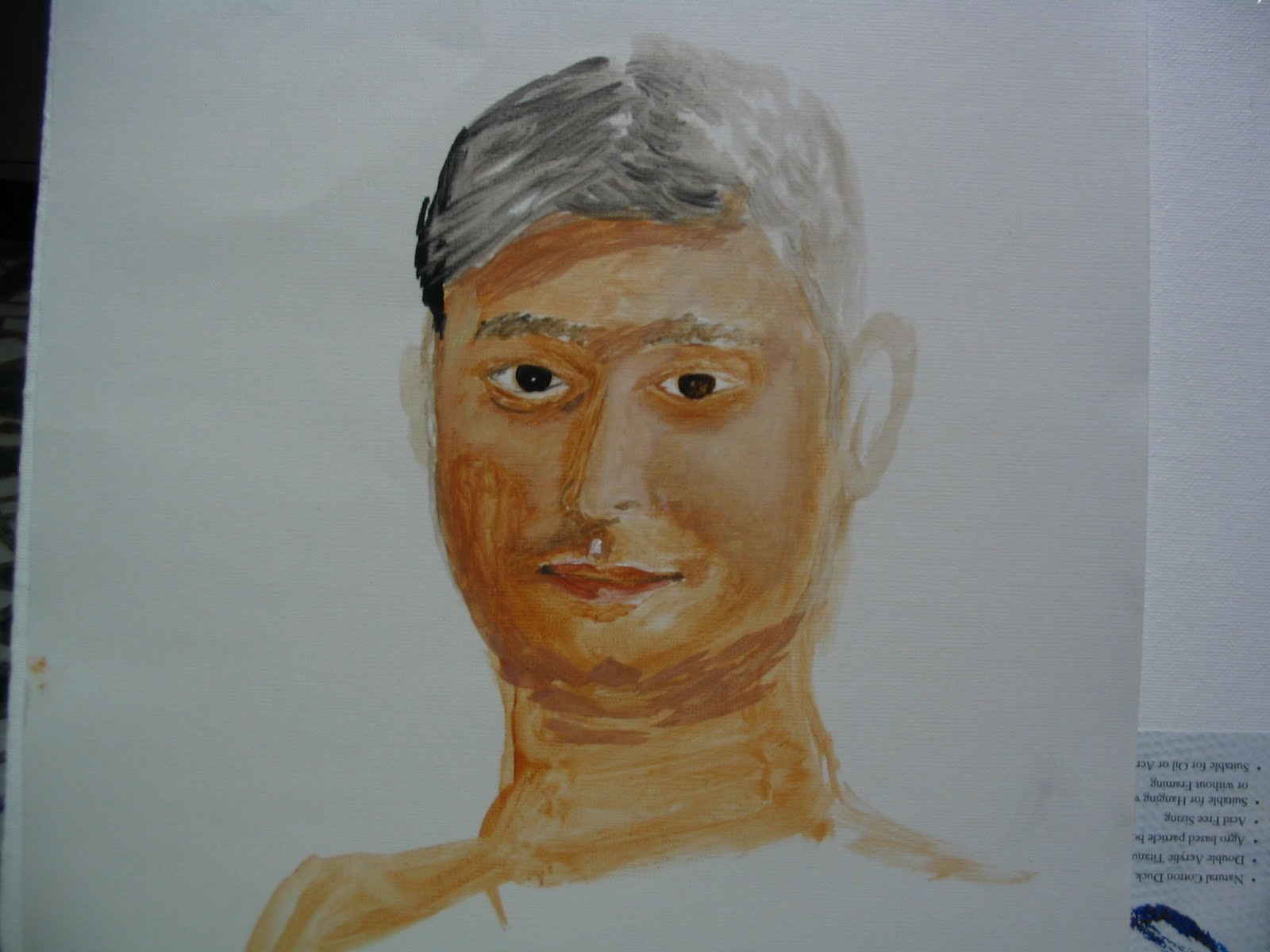
 My joy knew no bounds when i was doing this portrait. Perhaps almost the same as a zoologist would feel on discovering a new species. I was trying a pencil drawing of the pic, before jumping to do with pastels directly (you can actually see the pencil streaks as white lines , where the pastel powder didnt stick to the paper due to the pencil grooves :( !!) , as i got bored with the amount of detail i had to put in with the pencil and it wasnt getting interesting. The pencil nib is so sharp that it doesnt leave anyroom for you to experiment or to keep up the painting speed with your racing mind and put it on the paper. You sideline the creative side of the mind, and insist on not missing a single line while you do with a pencil, the same is not possible with pastel, inherently , its rough and thats good , you can race on, unmindful and unbounded. It took me two hours, after office, before my dinner. 12x11.softpastel on paper.
Thursday, December 10, 2009
Pastel Portrait
My joy knew no bounds when i was doing this portrait. Perhaps almost the same as a zoologist would feel on discovering a new species. I was trying a pencil drawing of the pic, before jumping to do with pastels directly (you can actually see the pencil streaks as white lines , where the pastel powder didnt stick to the paper due to the pencil grooves :( !!) , as i got bored with the amount of detail i had to put in with the pencil and it wasnt getting interesting. The pencil nib is so sharp that it doesnt leave anyroom for you to experiment or to keep up the painting speed with your racing mind and put it on the paper. You sideline the creative side of the mind, and insist on not missing a single line while you do with a pencil, the same is not possible with pastel, inherently , its rough and thats good , you can race on, unmindful and unbounded. It took me two hours, after office, before my dinner. 12x11.softpastel on paper.
Saturday, December 5, 2009
First Pastel paiting
Floating in the same ethusiasm, i bought a new set of soft pastels for some hands on . Camel soft pastels set with 20 shades. Only one kind camel has. The shop guy told me they have some local made soft pastels, each stick costing around 20 - 30 rupees almost equal to oil paint tubes of medium size. Now i know why. The camel set cost me 130. Pretty good for a first hands on learning.
One thing i liked is the ease with which you can get down to paint anything. You dont have to "decide" about painting, anywhere anytime pick your box and your sketch book and start doing it. But oil painting on the otherhand , i have to pick a canvas (which is quite costly compared to a sheet of paper) so i HAVE TO get down to do a "serious painting". That sort of binds me down and i have to really pick a nice "full" time to start doing it. Add to it the hassle with gathering and setling down with thinner/brushes/palet/rag/tissues/board around! Pastels on the other hand is more or less like a sketch, you just have to get the box and sit down. Nothing else needed. Absolutely nothing else. Dont you like the sound of it ?
I get down to doing my pastels when ever i wish, right after office, quite late in the night, multitasking while conversing/watching TV anything anytime. It just fits in anywhere. I even used it on the train!! May it be a serious subject you want to do, or just practise "plein air" (which iam currently interested in doing) Comparing soft with hard pastels, softs feel much closer to oils and water colors and even the end results are not quite far off compared to hard pastels . Hard patels on the other hand have a texture of their own which is stamped on the end result quite conspicuously, right or wrong, the rendering is quite unique, of its own kind. Also the hardness tires me down quickly, my hands already sore with working overtime on computer.
so heres my pastel painting of "gondolas" , pic i was wanting to do since long in oil.
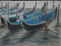
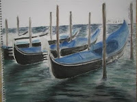 One on the left is with hard pastels . On the right is soft pastels. both little unfinished. One thing is i still dnt know how to control is the shedding of color, i have not bought a binder yet.
One thing i liked is the ease with which you can get down to paint anything. You dont have to "decide" about painting, anywhere anytime pick your box and your sketch book and start doing it. But oil painting on the otherhand , i have to pick a canvas (which is quite costly compared to a sheet of paper) so i HAVE TO get down to do a "serious painting". That sort of binds me down and i have to really pick a nice "full" time to start doing it. Add to it the hassle with gathering and setling down with thinner/brushes/palet/rag/tissues/board around! Pastels on the other hand is more or less like a sketch, you just have to get the box and sit down. Nothing else needed. Absolutely nothing else. Dont you like the sound of it ?
I get down to doing my pastels when ever i wish, right after office, quite late in the night, multitasking while conversing/watching TV anything anytime. It just fits in anywhere. I even used it on the train!! May it be a serious subject you want to do, or just practise "plein air" (which iam currently interested in doing) Comparing soft with hard pastels, softs feel much closer to oils and water colors and even the end results are not quite far off compared to hard pastels . Hard patels on the other hand have a texture of their own which is stamped on the end result quite conspicuously, right or wrong, the rendering is quite unique, of its own kind. Also the hardness tires me down quickly, my hands already sore with working overtime on computer.
so heres my pastel painting of "gondolas" , pic i was wanting to do since long in oil.


Sunday, November 15, 2009
Portrait


Underpainting
http://www.essentialvermeer.com/technique/technique_underpainting.html
Lets talk about underpainting. I have really not used this technique extensively ( talking about it, i havent really painted so extensively either, i really have to count all my x y z paintings someday )
I am putting it here just to log it.
Cant really seem to remmember this while actually doing my paintings. I have a variety of ways to start a painting and it really depends on the subject.
Perhaps underpainting work well when you are doing a detailed subject, like, a portrait or still life . Landscapes cannot really use underpainting a lot, that requires a lot of "division of colors, spaces" before hand, and landscape, atleast i do landscape, gradually with layering of colors and placing the things in . top to bottom usually.
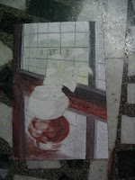
Check this below painting of still life 16X10 where i have used underpainting with burnt sienna and gray. And rightly, underpaintings are usually done in translucent warm colors, burnt sienna being one of them .
For understanding more about underpainting, check the link at the top.
Lets talk about underpainting. I have really not used this technique extensively ( talking about it, i havent really painted so extensively either, i really have to count all my x y z paintings someday )
I am putting it here just to log it.
Cant really seem to remmember this while actually doing my paintings. I have a variety of ways to start a painting and it really depends on the subject.
Perhaps underpainting work well when you are doing a detailed subject, like, a portrait or still life . Landscapes cannot really use underpainting a lot, that requires a lot of "division of colors, spaces" before hand, and landscape, atleast i do landscape, gradually with layering of colors and placing the things in . top to bottom usually.
Check this below painting of still life 16X10 where i have used underpainting with burnt sienna and gray. And rightly, underpaintings are usually done in translucent warm colors, burnt sienna being one of them .
For understanding more about underpainting, check the link at the top.
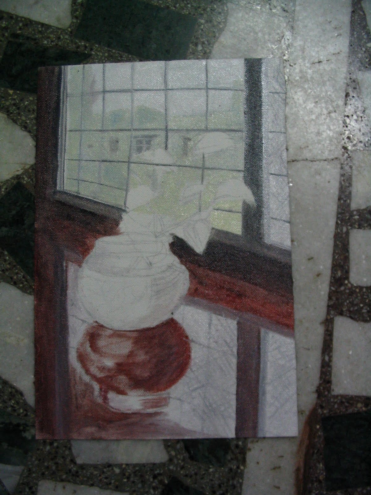

It didnt really turn out to be that great an example, but whatever.Iam yet to finish the paiting by the way.
If you think about it, underpainting is a total opposite of glazing. It aids the form and composition rather than the color, texture of the painting.
Excerpt from the link :
"In its simplest terms, an underpainting is a monochrome version of the final painting intended to initially fix the composition, give volume and substance to the forms, and distribute darks and lights in order to create the effect of illumination.with a minimum of effort, an artist is able to envision quite accurately the totality of his pictorial idea. He could observe the defective parts of the painting and correct them with relative ease, for it is far easier to model with a few neutral tones than with more complex color mixtures. Even broad areas of the canvas which seemed too dark could be easily worked up and lighter ones darkened "
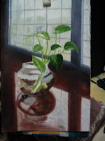
Saturday, 27-Nov-2010
I think i need to finish this painting soon . It might be soon that i will have to leave this place. And i realise, what else than this painting to remember my room with the peculiar window and the red wood walls.
Please give me Time Time Time, some,
Quiet leisurely time and leisurely mind.
Iam there, and almost there.
Thursday, November 12, 2009
Pastel and Glazing

It wasnt so detailed that it would takes eyes off the background mountians which were the main center point of the painting. This is the reason why didnt want to tweak the righ corner rock a little more and improvise few flowers that i found around the place.
Thats when i started wondering if i should be using glazing (or was it glazing that i used to finish the rock) . I used very light back paint, more of the thinner than paint really, to smudge over the rock to get the leaky rock black moss effect. And then used a little similar white and green highlights for the greenish moss and black for moss in shadow areas. It satisfied me sufficiently.
Thats when i thought i should really start using glazing much more consciously than accidentally stumble upon. And around the same time my young friend who was interested in learning art through pastels had come for my help/advice. He is 12 year old with 50 hard pastel set. What is a best medium to learn about glazing than pastels !! where most of the mixing of colors is done on the paper through glazing/layering.
For basic idea of what is glazing , check this link:
http://painting.about.com/od/oilpainting/a/GeraldD_glazing.htm
http://www.essentialvermeer.com/technique/technique_glazing.html
Thats when i started pastels and did this still life, copied from a oil painting image, more images when i finish it.
Werfen Castle


14 X 16 oil on canvas . With a Reference Photograph (Digital) Image.
This was my first attempt on serious landscape paintings.
Manali Valley painting
This is my first 16/24 (oil on canvas) painting .
Lessons :
(while glazing the right bottom rock)
1. Glazing/Layering is best when done with pure colors not opaque/mixed ones.
Glazing does not really have the problem of sap green/burnt sienna, ie., chrome colors because you put the pure color on an existing color, this will make up for the "opaquing" of the color which is needed to make the color look realistic on the canvas. During usual painting you do this on the pallet, and in glazing you do it on the canvas.
 For the readers, most colors of life objects we see, are opaque, they are not "colors" directly from the tubes, almost all of the colors on tube need a little opaquing.
Organization of the Posts
Each Post will be about a specific painting that iam doing/done/started and will be a continuous topic . When i have new information to add to a existing post ie., for example when i make any changes to a painting i have been(trying to finish) doing, the corresponding post will be updated. So, just mind that this blog doesnt always grow linear.
The purpose of this blog is both personal and presentable.
To mainly capture my paintings in-progress and is a sort of journal to log my own painting learnings and at the same time present it to others who hope to learn something out and are relatively beginners .
I can be very lazy in finishing a painting and even more lazy in updating the post, so kindly be patient. Thanks for reading ! Keep Looking .
Subscribe to:
Posts (Atom)